How to Make a Project Timeline in Google Slides (3 Ways — and When to Generate It Instead)
Google Slides has no Gantt chart and no timeline tool worth the name — but everyone's plan still has to end up on a slide. Here are the three real ways to draw one in Slides, where each falls apart, and the point where generating beats drawing.
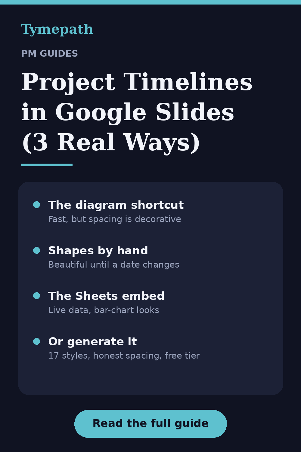
Google Slides is where plans go to be approved. If your company runs on Workspace, the exec review isn't a PowerPoint file — it's a Slides deck someone shared twenty minutes before the meeting, and the request lands the same way it always does: "Can you drop the timeline in there?" Then you discover what every PM on Google Workspace eventually discovers: Slides has no Gantt chart, no timeline object, and a diagram tool that thinks your project has exactly five phases. Here are the three real ways to do it anyway, and the honest point at which each stops being worth your evening.
Method 1: The built-in diagram shortcut
Slides does ship one timeline-ish thing, tucked away in Insert → Diagram → Timeline. Pick a template, set the number of dates, and Slides drops a pre-drawn graphic onto the slide.
- Insert → Diagram, choose Timeline in the sidebar.
- Pick a template and the number of entries (they cap out quickly).
- Click into each placeholder and type your phase names and dates.
- Recolor via the sidebar options before you insert — it's harder after.
When it works: a high-level "five milestones on a line" graphic for a kickoff deck, done in three minutes. When it breaks: almost immediately after that. The entries aren't tied to real dates — spacing is decorative, so March and April sit the same distance apart as April and December. There are no durations, no bars, no swimlanes, and once inserted it's just a pile of grouped shapes; adding a sixth milestone means ungrouping and rebuilding the spacing by eye.
Method 2: Shapes and patience
The approach most real Slides timelines are built with: draw it yourself.
- Draw a horizontal line; add text boxes for months or weeks along it.
- Draw a rounded rectangle per task, sized by eye to its duration.
- Diamonds for milestones, color per workstream, labels in or beside each bar.
- Use the alignment guides religiously, and group each lane when it's done.
When it works: it's the only native method that produces bars, lanes, and something an exec reads as a roadmap — and with taste and an hour, it can look genuinely good. When it breaks: the first date change. Every slip means nudging rectangles and re-eyeballing proportions, and because spacing is by eye, your timeline quietly lies — a three-week task drawn slightly long reads as a five-week task from the back of the room. Multiply by every revision between now and the review.
Method 3: The Sheets chart embed
The Workspace-native power move: build a stacked-bar Gantt in Google Sheets, then embed the chart in Slides.
- In Sheets, make columns for Task, Start date, and Duration in days.
- Insert → Chart → Stacked bar, with Start and Duration as the two series.
- Format the Start series to be transparent — the invisible segment pushes each bar to its true position.
- In Slides: Insert → Chart → From Sheets, and pick your chart. The embed stays linked — when the sheet changes, the slide shows an Update button.
When it works: this is the only native method where the slide updates from data, and for a simple single-team plan it's honestly decent. When it breaks: vocabulary, same as Excel. No milestone diamonds, no swimlanes, dependencies don't exist, and the axis is a chart axis, not a calendar. It looks like a bar chart wearing a Gantt costume, and the linked-chart Update dance surprises exactly one presenter per meeting, live.
The moment to stop
All three methods hit the same wall: Slides is a place to show a timeline, not a tool to build one. The plan lives somewhere else — a sheet, a CSV export, a task tool — and every native method makes you re-draw or re-torture that data each time it changes. Which it will, usually the night before.
That handoff is what we built Tymepath for. The loop: paste your task list or upload the CSV/Excel you already have (PDF works too) — each row becomes a dated block. Pick from 17 styles — classic Gantt for the delivery team, swimlane roadmap for the exec review, milestone view for the launch plan. Edit in a table, not on a canvas: when a date slips, you change a cell and the timeline redraws with mathematically honest spacing. Then export a PNG and drop it into Slides with Insert → Image — or take the PowerPoint export if part of your world still lives there. When the plan changes, re-export and swap the image: thirty seconds, no rectangle nudging, and the bars never lie about durations.
All of that is on the free tier, no credit card. Pro adds AI layout for genuinely messy pasted lists and program-level rollups across teams — but a single project timeline for Thursday's deck is squarely a free-tier job.
Which method should you use?
| Your situation | Use this |
|---|---|
| Five milestones on a line, kickoff deck, done forever | Built-in diagram |
| One showpiece slide, time to burn, dates frozen | Manual shapes |
| Simple plan, lives in Sheets, team is chart-tolerant | Sheets embed |
| It has to look right, and dates will change | Generate it and drop in the image |
The 10-second version
Google Slides can display a beautiful timeline and cannot cheaply build one — no real timeline object, no date-true spacing, no swimlanes. Keep the plan where it lives, generate the slide from it, and let Slides do what it's good at: the meeting.
If your plan looks like a launch, a migration, a hiring push or a quarterly roadmap, browse the timeline template gallery — each one renders a real timeline with sample tasks you can swap for your own, then export as PNG for Slides or straight to PowerPoint.
Try Tymepath free
Turn a messy task list into an executive-ready timeline slide in minutes. Free tier, no credit card required.
Try Tymepath free